Be Creative, Get Published!
How to Create an Advertisement
Photos & text by Jarmo Pohjaniemi
People think that just because I shoot for Playboy, all I do is take pictures of centerfolds every day. While that does happen and I do stay busy, there are times between shoots that provide an opportunity for me to undertake other projects that are not only lucrative, but can also be challenging and rewarding.
In photography, like any other visual business, workflow and results are some of the most important factors. There was a time when editors used to say, “As long you shoot great pictures, you’re fine!” In other words, you had to make your boss looked good in front of their bosses if you wanted to keep your job – there’s always going to be someone above us to which we must answer, even bosses.
As editors and directors make plans for the new publication, magazine or whatever the final product may be, it always points to the same thing – it must be of superior quality. As former Playboy director of photography Gary Cole succinctly put it, “I can print your pictures, not your excuses.”
Just a few days ago during a shoot, one of the editors who was present says to me, “Why don’t you take the images back to your place and do an awesome edit as you would see it.” What this means is that an editor trusts your judgment and lets us photographers exercise our vision as we see them through our eyes.
Actually, this often makes an editor’s job a lot easier by giving them more variety with which to work. There is nothing quite more stimulating for a client or editor than be able to see a plan coming together. This could be a storyboard or perhaps a mock-up of the final product that you are about to create. Often, clients and editors have an idea of what the outcome of a photoshoot should be, but they are not photographers – this is why they hire a photographer, an art director, a stylist, etc.
Everyone in the production crew has their place and a task to do. Now, if you are jack-of-all-trades and can already offer your client something completed ahead of time, you have already won half the battle and likely to get many more assignments by showing your true abilities.
This may even save your client tons of money because now, they do not need to hire extra thinkers to do the job. Here is another example: You know of a local swimsuit company that would like to produce a catalog, calendar or one-page ad for a magazine. More often than not, these clients don’t know where to start, but they do know the results should be an ad that creates more sales for their business.
Now, because you have done your homework, you put a presentation together, rush to their office and introduce yourself to the owner or manager. You let them know you heard they were looking for a photographer, and here you stand, the answer to their prayers.
You show them your goods and blow their socks off (assuming that your presentation is very good). The catch here is that you have capabilities to make things look good because you are a photographer who deals with these type of things every day – the storeowner or manager does not! This means you have a very good chance they’ll take you up on your offer and might even say, “Well, we were actually looking for a photographer to shoot something like this for us!”
This is just one example of how to sell yourself for the market. Being a photographer is one thing, but being a working photographer is something completely different. Most of us do not have clients knocking down our doors – we need to go after them. This is where your marketing skills come in handy. This doesn’t mean you have to kiss their butt, but it does mean you are good at what you do and it doesn’t matter how you get the gig, just as long you get it.

Putting it into practice
Here is a workflow example to show how to create an ad from scratch. You can apply these methods to any product, but since this actually happened to me, it might serve as a better example. Recently, I saw that our local Fun-Glass Hut was looking for a photographer for their new ad campaign. I thought to myself, “What’ve I got to lose?” I can quickly shoot some sample images that may fit their product line and if nothing comes of it, at least I got some great images to put in my portfolio for later use and cool stuff to post on Facebook and market myself as something other than a centerfold photographer.
No Shortcuts • Get a pair of glasses (and not the cheap ones!) at the retail store you plan on approaching. Next, find a model that best suits the style of both the store and the glasses. The model is actually a very important part of the shoot, so don’t be afraid to spend money on a good one that can do the job – think of it as an investment. What you want is for people to look at the ad and the better the model, the longer they’ll look.
Experience talks • Just as you want to find a good model, you’ll also want to get a makeup artist (MUA) who has experience! Be upfront and let her know that this is being done on spec so maybe you can make a deal. For projects like this, it’s good to negotiate with the model and MUA for an agreement that’ll benefit everyone. For example, if you get the job, you’ll pay them an $x amount and maybe throw in some pics for their portfolio… Viola!
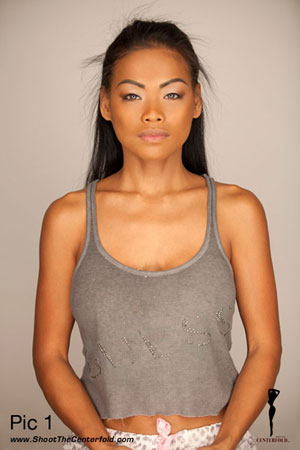 Look before you leap • On the actual day of shooting, while the model is being prepped by your MUA ask her to take a short break and step in front of the camera for a few quick shots to test your lighting set-up. It’s important to evaluate how the make-up will look early on before her face is completed in case changes or adjustments need to be made. It’s easier to fix things at the start, rather than starting over from square one.
As you can see in this sample image (See pic. 1), I tested my model at a very early stage of the makeup application. I’m doing this because I want to follow up and see what the makeup is going to look like. This is very important 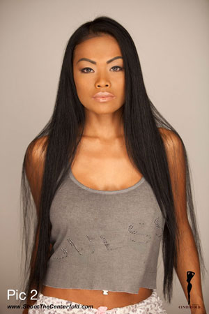 because makeup can be done in a million different ways, so you’re going to want the best possible looks that not only suit the model, but also what you have in mind for the shoot.
I also realized that the MUA was putting a little too much shimmer on my model’s eyes. (It’s good that I noticed this at early stage of the makeup because too much will take away from the product – you want people looking at the sunglasses, not her eyes). Normally, this would’ve been fine because fashion usually calls for that kind of look, but not this time.
The product is the single most important component of the shoot, and right now, the makeup needs to match and support the eyeglasses I am about to shoot. With this in mind, I prefer makeup to be done first with the hair pulled back. This way, I can focus primarily on the makeup to where it’s not supported by other components, like the model’s hair.
Working with your MUA • When your MUA 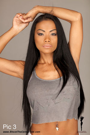 is done with your model’s makeup and you’ve taken a few preliminary test photos, let her hair down and see how everything works out so far. At this point, add a light coat of lipstick and see if it supports the product. The reason you add a light coat is that it’s easier to add more than it is to remove it.
In this kind of shot, it’s also quite important to make sure that the foundation looks solid and smooth. Here is another challenge that is often overlooked by MUA’s! You must make sure that your model’s facial skin-tone matches her neck and blends into her chest color (as you can see in this sample image – See pic. 2 – where the model’s face is slightly darker when compared her chest area).
Adjust the makeup color to match rest of her body because the image has to look realistic. If you fail to give your MUA the proper 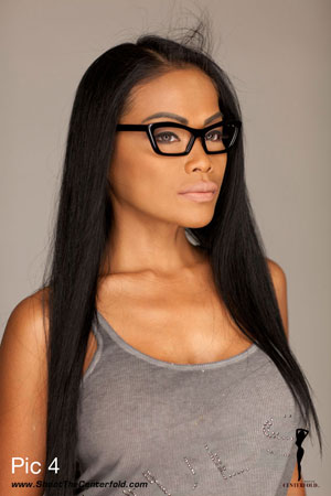 direction, test and follow the progress, you might end up getting something very different from originally planned.
For this type of shot where realism is a necessity, one thing you must watch for is an MUA being a little excessive in their applications because they’re used to putting on a heavier coat to show off their work, rather than using the subtle touch needed for this image.
Wardrobe Choices • Now that makeup and hair issues are almost resolved, it’s time to practice poses and choose the right angles for the shot. Every model is different and seems to have their good and bad angles. One specific look which may work for one model does not always work for another. (See Pic. 3 & 4).
Swinging it is not my style and I like to find 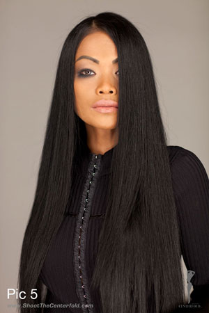 specific angles that support what I am about to do. By trying the eyeglasses on my model, I quickly realize that they are very heavy looking and dominant because they are black and thick framed eyeglasses.
Her hair blends very nicely with the glasses, but the rest of the wardrobe we had previously selected does not work. We had picked lots of light-colored blouses, lingerie and shirts, so it became more of a color play than a well-balanced image. (If my model were blond, I could get away with a colorful wardrobe, but in this case it would conflict with my model’s strong, dark features).
We searched a bit deeper though our wardrobe selections, and this time we found a nice black sweater that had some texture that would show up well in the picture, balance the dark areas, and prevent them from falling to total black. 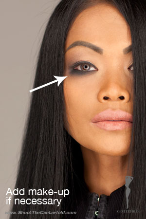 This was a good choice and I was satisfied and ready to shoot.
While all this may seem like a lot of preparation, in the end it’s actually not. Even though it took a bit of work, that’s fine because this is an important segment of the shoot, especially when you are going to knock some doors down and impress people while trying to get your next assignment.
After clicking away for a bit, I can see that the makeup is too light on my model’s eyes. The contours are not coming across as I would have wanted, so we need to gradually add some more eyeshadow because as I mentioned before, it’s easier to add than to take away (See pic. 5).
Pic count • The shoot progressed at a good rate and lasted about two hours, resulting in lots of excellent choices. I shot about 400 to 500 images, which is much less than if I were shooting a real pictorial with several poses – my usual actuations per day ranges from about 1000 to1500 images in an eight-hour day. Most of the time was actually spent preparing for the shoot instead of actual shooting time.
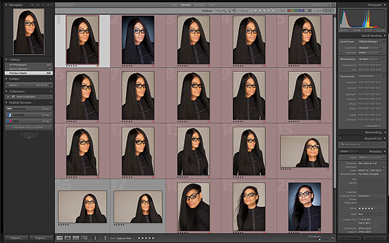
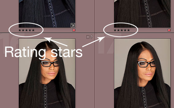
Let’s look at some of the images we got today and choose best ones. I usually use Adobe Lightroom for editing and color correction. I go through all the images and add a one-star rating for those I like. When I’m done, I then go through only my one-star ratings and add a second star – a two-star rating – for the second round of the culling process. From those two-star images, I repeat the process until I have come to a final 12 images that all now have a five-star rating.
Continue after the images… ⬇
Adobe Lightroon Grid mode ⬇
Adobe Lightroon Star rating ⬇
Below are 10 final optional images for us to analyze and see why some of them are better. ⬇

A. Great balance, piercing look that highlight the eyeglasses well. Very statue-like and this image is visually powerful. I also think that the reflection in the eyeglass frame also works very well and adds a nice, bonus highlight that often brings the product alive by giving it a three-dimensional quality. (This kind of highlight technique is often used in car commercials where you see reflections on the body of the car.)
B. This image is shot from a higher angle that seems to hide the model’s eye-shape under the upper corner of the eyeglasses. Eyes are an important part of the image that are framed by the eyeglasses and must be visually suitable and viewable.
C. This image was a great candidate during the selection and editing process. When compared against the final 10 selections, you quickly realize that the model’s posture is not the best possible. She is leaning too far forward from her neck. This might have gone unnoticed if this image would have stood by itself. The good thing about having several images during your edit is that you have a good selection of reference points that can be compared against the other possible images.
D. Model’s face is too much to camera right. This was not a big factor until compared against the other candidate images. Also, the model’s chin is slightly too low, which often creates a weak presence in the final image.
E. This image was actually my second favorite image during the editing process. It offers good eye-framing, powerful posture (and very similar to Image D, which fell short in presence). The only reason I considered degrading this image to a three-star rating was that the model’s lips were open, which created a less than solid result.
F. Very good eye-framing by the glasses, but did not offer a convincing look – model’s lips are pouting and not 100% natural. After comparing it to Image A, I saw the shortcomings and moved it from a five-star to a four-star rating.
G. This is a dupe of Image A. I processed the image with Lightroom to give a look that you often see in new-age fashion magazines like Razor, Zink or Soho. These all are excellent magazines that offer little visually, but contain edgier images that are often color saturated with sepia, cold tones, and B&W shades. As interesting as this may look (and even though they took my imagination for a ride for a second), I finally reminded myself that after all, I’m on a mission to go and convince my local eyeglass store that I was their new protégé who was going to elevate their ad campaigns to a whole new level. The safest direction would be a good walk on the wild side with rainbows in my mind.
H. For photographers who use Photoshop or a similar editing system, this process should be in your bag of tricks. Even if you already know that the image is not going to end up being B&W, you should still try to satisfy your curious mind (even if you do realize Helmut Newton probably never intended to photograph eyeglasses). B&W images are often very powerful and the only type of photographs to receive consideration by many in the fine-art photography market. As we are colorfully talented and choose to shoot for the commercial photography industry, we must leave B&W and the fine-art market for a later day.
I. In a second dupe of Image A, this has a slightly higher contrast than you see in the original image. While this may look appealing to some, it is a little too contrast-y for what we need. When this specific image is evaluated on a computer monitor, you might be able to use it for something with extra contrast. However, if this image was to be printed for the purpose of becoming a poster on the wall of the eyeglass store, the dark areas would almost surely fall to solid black and all the texture detail would be lost.
J. Here is another version with HDR treatment that makes details and mid-tones brighter. This is almost comparable to current fashion imaging in the world of photography. However, as popular as they are in the magazine photo pages of today, they are still not making the cut in fashion magazines or advertizing campaigns. When using HDR, make sure to be very careful and apply it in small quantities so you don’t get carried away with it. Clients in today’s product photography want their products to look realistic instead looking too processed.
Now I that I have chosen a final photo (Image A) as the “winner” of the selection, I think this image offers the best in both the presence of the product and the angle it was photographed. The model’s eyes are framed nicely in the eyeglasses and it’s important that the product that we are photographing shows its purpose and is clearly visible. ⬇
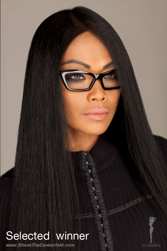
As this final image works well as is, we can go even further by dressing it up with an optional gradient on the background, and add a color overlay to give it a little edgier look. This clearly is a question of taste and preference. That’s why it’s good to be prepared to have more than just one option to present when meeting your possible future client. ⬇
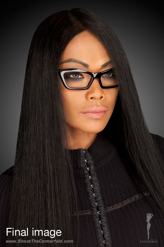
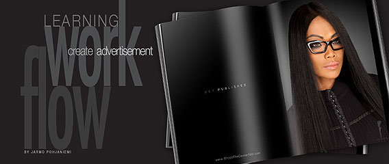
Here is what we are going to accomplish by using Photoshop (Final image). Next week, we will continue this discussion in a step-by-step process where you’ll see how this image was edited by using Photoshop, which also is an important part of the process before printing or publishing. (You must have Photoshop 4.5 or a later version to be able to use the post-process).
Until then, stay tuned!




This is a very great analysis of the power and of the impact of the image based on different attitudes of the model. Subtil details are contributing to make from pictures THE picture spreading the perfect message ! It is true that the customers are not always able to analyse the picture but they can feel unconsiously that THE selected picture fits with their expectation !