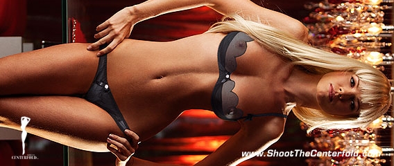
You’ve been framed!
Framing is something we all like to do. From family pictures at your grandparent’s house, a few posters put up to cheer up a room, small silver-framed photos of our loved ones placed on a table near the sofa, even a few snaps of the family pets. That being said, why is it that we like to put our best photos into cheap $12.95 Target picture frames, or ones that we got out of a bargain bin at the dollar store? Maybe because we’re just used to doing it this way and never have really given framing a second thought.
An integral part of displaying a photo is the choice of a frame. Just as a woman’s hair is her crowning glory, a frame completes the image by providing a secondary visual emphasis that brings attention to the image either through color, texture, or material used. Just as the photo is a matter of personal preference, the appropriate frame is a question of taste. However, not everyone shares the same vision, and might not even have an understanding of style, framing, and composition. Believe it or not, this is a good thing, because as with art and all things creative, there’s no right or wrong, but an educated guess is better than none.
As far as framing and photography goes, there are many blank spots in a photographer’s knowledge base when it comes to framing and cropping (and I don’t blame them because in all honesty, those cheap Target frames actually work sometimes – besides, they’re a great deal).
Regardless of the intent and frame of mind, the primary criteria in selecting a frame is to emphasize the elements in a photo and guide the viewer’s attention to a specific area that is supported by framing (i.e., composition) and cropping to isolate unnecessary elements which may interfere with the image’s subject matter.
Framing your image to a specific crop can work wonders… but it can also ruin the image completely. Keep in mind that a good way to maximize a photo’s potential is – are you ready for this? – make sure that you have a subject worth looking at. Every picture tells a story, true, but it shouldn’t be a mystery to your readers what you’re trying to convey, or interpreting the type of narrative contained in the image. Not all the images work the same way as this sample image. Some images look better without cropping, some don’t.
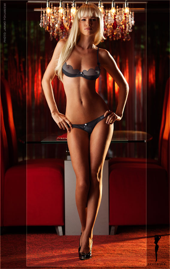
But what does all this have to do with glamour photography? Why are frames so important? I’m glad you asked.
When submitting your images to a publication, one must realize they don’t all play by the same rules, compositionally speaking. They will crop images to fit their style, taste, or layout at hand. For example, Playboy’s centerfold (we actually call it a “gatefold”) is a segmented two- or three-page combination foldout that fits into a magazine format. However, this is not the only reason why it’s cropped to a gatefold format. It’s also cropped this way to maximize the visual experience by providing more model, less background.
Without getting too technical, the average full-frame camera today is capable of producing an image with a 2:3 aspect ratio, which in the old days was the same as 36x24mm film frame for a 35mm camera. The aspect ratio for a standard 8×10” photo is 4:5, which is why there would always be some cropping to a 35mm image when printed as an 8×10” photo. To get the “full frame” back then, you’d have to print your images in an 8×12” size.
If you were to look through the viewfinder of a 35mm camera while shooting a centerfold, you would only be able to use 75 percent of your focusing screen’s image area. If you were to print a centerfold on an 8×10” paper, the image coverage area would be only 4.75×10”, leaving a little over 3 inches of space blank due to the image ratio.
If you ever get a chance to see archive footage of a centerfold being shot on an 8×10 camera, you’ll sometimes notice markings on the focusing screen and designating the dimensions of the centerfold’s area. Granted, it was bit easier to establish the correct sizes when using a Deardorff, but having to battle that beast of a camera was a daily struggle and the bane of many an early Playboy photographer (just ask Byron or Steve).
Cropping an image is art unto itself. You can adjust the presence of your subject by cropping the image to fill the full frame with the subject/model. Of course, this can and will be done in post, but the true art and photography masters do just the same in camera. Would you practice your artistic vision in camera, or leave it to some unknown photoshop editor to tell you how your images should look? I didn’t think so. Of course we all have experiences like seeing the layout that we shot coming out in a magazine, and sometimes our first impression is a state of shock because the images are wrongly cropped based on the photographer’s artistic vision. I personally blame the economy – cutbacks have caused editing staffs to become nonexistent.
Camera mask
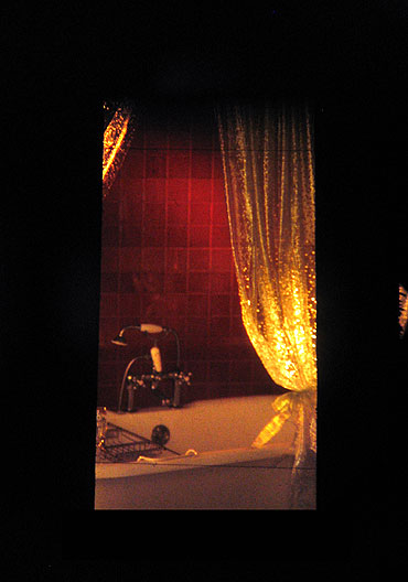 Here are a few samples from my own experiences when shooting a centerfold. To this day, we still use the same technique. We drop a custom-made black frame in front of the lens to see exactly how a centerfold’s cropping will work in a specific pose and situation. This system has been used for decades for one reason: it works. Countless headaches have been avoided by being able to view the cropping carefully and shooting variations of the shot just in case there needs to be more (or less) breathing room in your image. You wouldn’t believe how technical these croppings can get. There’s a lot riding on getting it right the first time and a “fix-it-in-post” solution is a clear indication that you’re not at the top of your game and clearly not talented enough to deliver a first-class product.
Before I go on, I first have to mention that just as a centerfold has to have a specific cropping, so does a cover. These are two different processes, but the execution is similar. While a centerfold has no text except for the month in the corner and signature overlays, a cover image must allow for the masthead (the title) and the assorted text for the articles and features. Sometimes it gets a little tricky and we have to place a portion of the model’s image over the masthead, but it’s all the same process for each cover.
To give you an idea of how we do this, we merged an old idea with a modern one. In the past, we would have test prints made, usually Polaroids, and what we’d do is lay a clear mask with the Playboy masthead on top and place it over the image to give us an idea of the size and layout. It was usually an arduous task, because once you established the size and proportions, you were locked into that position, more or less.
However, with the advent of computers and workflow software, we took this idea and made it conform to the equipment we were using. Instead of using a traditional lightbox meant for slides, we were now using our computer monitors to view our images. While the process was amazing, we still needed a fast, easy way to evaluate the usability of our photos as cover pieces. Over a period of time, the method progressed into the process we use today.
The set

I keep hearing that symmetry is the key to a perfect cropping. Well, in some cases, it is, but this is only a buzzword and not an artistic statement. Sure, there are rules to photography that we are supposed to go by, but they should only be considered starting points, not something written in stone. The real magic is up to you and bending the rules is part of the process. Yes, it does sound like a trite answer and perhaps have heard countless times, but it’s true and bears repeating.
Here is a typical image that editors must do battle with on a daily basis. The layouts come first, then the images, and it’s this trying to fit them into a specific size that kills you inside. Unless you took variations on this image during your shoot, an editor would be forced into making a decision of where to do the cropping – this is where it gets ugly. You might find your “masterpiece” cut and trimmed to fit inside a small tight frame. This is why it’s so critical to obtain an artistic vision so with each shot, you’ll not only see one option, but several. There doesn’t have to be a huge difference in every shot, but there has to be something in each one that will give an editor a choice and allow them to do their job well. Yes, editors can be tough, but they also want to make you look good. In the business, it’s called “shooting for edit” and that translates into putting money in your pocket.
Shoot to edit sample
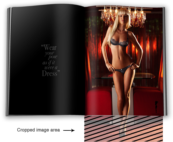
(See above) 35mm original image format does not always fit ideally to all magazine specifications and cropping may become necessary.)
Cover mask and cropping
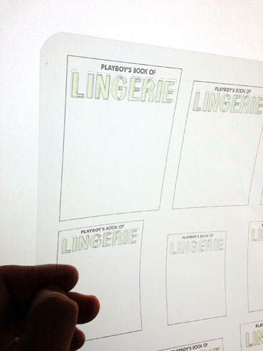 The mask we use today is similar because it’s just a mock cover template; a clear piece of plastic covered with a series of line reproductions of the cover dimensions and masthead, all in different sizes and one for each Playboy publication. What we do is bring up our images in Adobe Lightroom or any other software, either as thumbnails or full size. For each Lightroom viewing mode, there is a corresponding template on our clear mock template. All we do is place the page over the computer monitor to see where the lines fall. This way, you can clearly see where the word “Playboy” (or other magazine title) will fall and how much space you have to work with when shooting for the cover. This is an industry standard for almost all major magazines today. It’s proof that some ideas will always be useful, improved with a few modifications to allow for the passing of time and the introduction of new technologies.
Back to the mask for the centerfold. It’s essentially the same process as for the cover, but it’s just a black plastic window-shaped mask that’s placed in front of the camera to give you an idea of the area you’ll be working with, space-wise. In the old days, a huge print would be made and the mask would be placed over the picture to view the dimensions of the centerfold image. If I remember correctly, in some of the early Playboy videos made during the ‘80s, you can see Hef using a similar mask to judge the centerfold candidates.
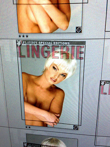 Adobe Lightroom, like many other editing software, offers great tools for us to adjust in the back-end. Unfortunately, the truth is that publications don’t care about your editing skills and would rather have your RAW files. By the time you finish editing your shots, you’ll most likely have missed out on an opportunity to have your photos used. If you think your clients don’t remember things like that, you’ll be wrong and it’ll give you something to think about while you’re having to climb a step down the ladder.
As I mentioned earlier, when cropping or framing images that have a model, you’ll also have to consider the placement of props and how they’ll fit into the cropping as well. I’ve seen an excessive amount of images that have half a lamp, part of a picture on the wall, or some other element that just looks weird. Anyone can be a technically proficient photographer, but proper cropping is something that is the result of having an artistic eye.
Want to learn more about lighting and photography? Visit our store and explore our lighting and posing books.


