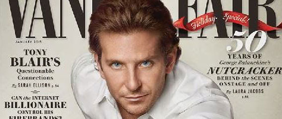
Behind the Scenes and Break-Down of Bradley Cooper’s Vanity Fair Cover Shoot
Here is another interesting behind the scenes video of Bradley Cooper’s cover shoot for Vanity Fair. Photographer Sam Jones captured the cover and even had an elephant in the shoot for an added element in what looks like a small apartment for an animal this size instead a dog or a cute kitten. Most likely it’s a set it creates the illusion of an apartment.
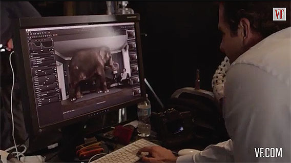
This kind of over-size element is often used for the shock value to captivate the viewers attention. So head up to the nearest circus like I did few years back begging for an elephant (which I did end up getting) except mine looked little malnourished dog compared to Bradley’s and the editor scrapped the entire shoot. I should have gone for the kitten.
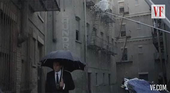
The main attraction in this shoot seems to be the elephant interacting with Bradley in human ways. I find this very clever with the addition of a rain scene for the extra value. Rain and umbrellas always add strong punch to any pictorial where they fit and it’s a good trick that adds value without stretching the budget. I have always been a huge fan of water elements which are easy to get and offer powerful visuals.
The cover shot seems simple with an Octa light modifier on camera left with a black cutter flag to reduce excessive light exposure which is compensated with a bottom fill silver foamcore bounce to open excessive shadowing. Also an additional silver foamcore was added to camera right for better light balance. Additional lighting scenarios have played a role based on spotting a few more black flags suggesting that light was subtracted for selection variety. This is a good and a simple lighting technique often used in portraiture. What else is in this nutshell is the computer for tethered capture using Capture One software paired with the Mamiya body and lens with a Phase back and L bracket.
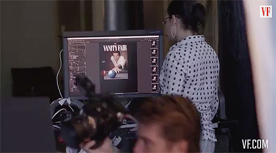
The final cover shot seems to be composited from its original background setting. This kind of thing happens often and it can really be a disappointment for the photographer who saw the shot and lit it based on his vision. One of the reasons for this type of change is usually a combination of added text-settings that do not play well with the colors of the original shot.
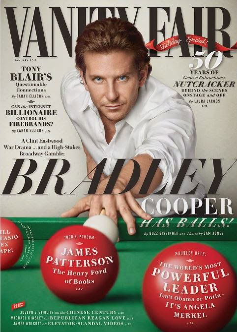
Some of the most successful covers are done to the simplest one color background that may have little to nothing to do with photography and everything to do with presence and the message of the editors who believe in their methods to sell issues, Bradley Cooper, and his balls.
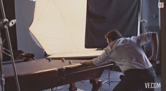
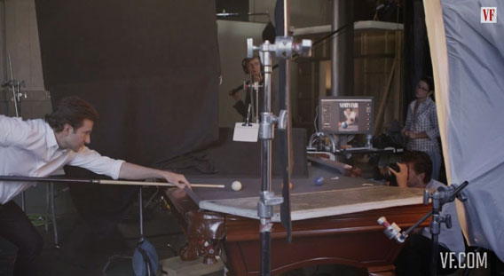
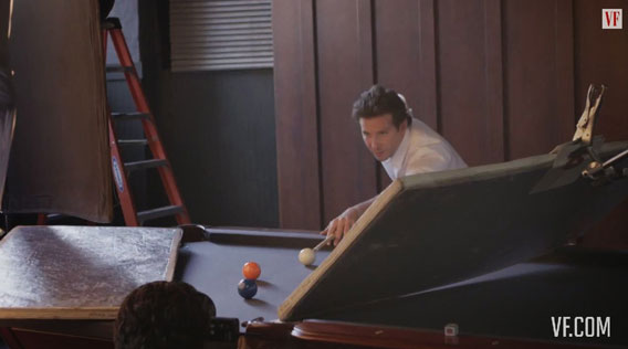
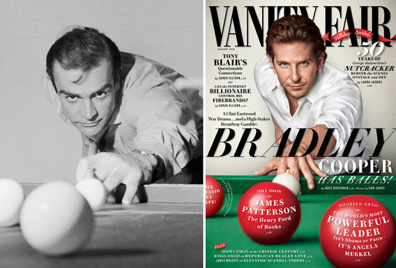 Chris Ware’s photograph of Sean Connery playing pool in 1962 (left), inspired Bradley Cooper’s cover pose (right) LEFT, BY CHRIS WARE/KEYSTONE FEATURES/GETTY IMAGES; RIGHT, PHOTOGRAPH BY SAM JONES.
See more at the Vanity Fair.

© 2014 Copyright ShootTheCenterfold.com. All rights reserved.


