Shoot the Cover the Editor Can’t Live Without
It has been said that you can pick the best magazine by its cover and that a cover without focus is a magazine without content and that bad covers belong to bad magazines. It has also been said that that you cannot judge a book by its cover, but if we apply that statement to magazines … it’s just the opposite.
Can we really judge a magazine by its cover? Yes, we can. A good cover will immediately grab the attention of potential buyers amongst a sea of publications on a typical newsstand. After 50-some covers that I have shot for different Playboy publications and numerous others, I can unequivocally say that every single cover was always carefully chosen with the publisher and/or the editors. Then there were follow-up discussions after the sales reports came in to see where we went wrong.
Conversely, applauses were given for strong sales created by the perfect cover. Occasional bonuses (aka tipping) were always a pleasant surprise. The most visually stimulating and clever cover ideas will make you best friends with the editors.
These are everyday routines for magazine editors whose jobs also depend on the sales figures of the publication. I keep remembering endless discussions with editors who would sigh,
Well, the choices are excellent but will they sell magazines?”
Then the decision is made based on the model or celebrity, concept, and her beauty in hopes to draw attention at the newsstands and magazine subscriptions.
 The work actually got quite involved with the editors. There were several trips to the newsstands where we would take a picture that was then sent to the editor to see the final placement. Was it visible enough and did it pop enough among the other publications? If the issue was not visible enough, the distributor would get a call from the publisher.
This kind of feedback is priceless for editors and publishers since there are too many distributor related flaws and politics which can easily derail possible sales numbers. Not all photographers got as involved with editors as I did but if you want to show the editor that you’re the person he needs, then be prepared to prove that you really are! (This is what I call a “good work relationship”.)
Celebrities on covers have become a sure fire way to sell more magazines than just using a pretty model. If we backtrack some 15-20 years, there were more models on covers of the publications compared to what we have today. The publishing industry has changed and will evolve with time.
Here are a few cover tips and facts for photographers:
- The cover model should look straight into the camera. Eye contact should be as inviting as if she was looking at you and calling your name.
- When shooting a cover image, keep in mind that you need to leave enough space for the masthead text. Include negative space and variety in your images for editors to choose from.
- The cover image should have a focal point as something has to draw the eye to the cover. For Playboy, ideally it would be cleavage.
- The cover image needs to have presence. No magnetism equals poor sales.
- Covers are usually divided into three sections: The full body shot, the three-quarter shot, or the face-shot that is cropped right under the (female) chest area. Conceptual cover can differ to anything!
- Try to avoid orange colors if the magazine is printed in traditional CMYK process as it will not reproduce well.
- The color green is known to be the least used color on cover pages. When you’re shooting, always think with editing in mind since a cover is not a cover unless it will work with color contrasts and designers.
- Magazines in the US are racked in waterfall presentation at the newsstands so the top third of the magazine is the most visible part and there you will see the masthead-title. In the European market the magazines are stacked so that the left third of the magazine is the most visible one. This is why there are so many magazines in Europe with the masthead in the top left position.
- Some of the most popular covers are shot on a solid background color. Any patterns or mixing colors in the background will make you very unpopular when graphic designers are laying out the cover page. Keep the background simple so that the type will pop.
- Yes, sex sells but there are different opinions, in different parts of the world, on what’s sexy and what’s trashy. Do your research of the end result you wish to achieve.
- It’s a known fact that if you have already shot a cover image that rocks and would like to replicate it, likely you will not get better results.
- A cover should have attitude, beauty, presence, and provocative sexuality assuming that we are selling men’s magazines. All-American publications for the Heartland sweethearts may also drip with classic glamour along with the sex appeal. Concept covers are also widely known to have success. The key to a good cover image is to have an image worth at least 1000 words.
- A great cover is one you can’t resist picking up because you like what you see. Gary Cole, longtime director of photography of Playboy magazine, once said, “Great covers smack you in the face and have to make me feel like I want to touch them!” “What?” I asked, “See what?” He replied, “You know it when you see it and I want you to deliver your best image and make my jaw drop.”
- The cover image should tell a story otherwise it’s too general. A strong cover has three ingredients: a powerful story, a compelling image, and a benefit for the reader.
- A strong cover for the general market should spark curiosity. If the viewer spends longer than two seconds and does not feel that, then you have no cover.
- Keep it simple and be your own worst critic before you deliver the goods for your submission or assignment.
- What do you think makes a magazine cover successful?
So, I hope that some of these topics shed some light on your plans. Remember that each cover should be accompanied by a pictorial which includes 8 – 12 usable images. But don’t be surprised if only a few of them get published and, even then, are cropped to a minimum.
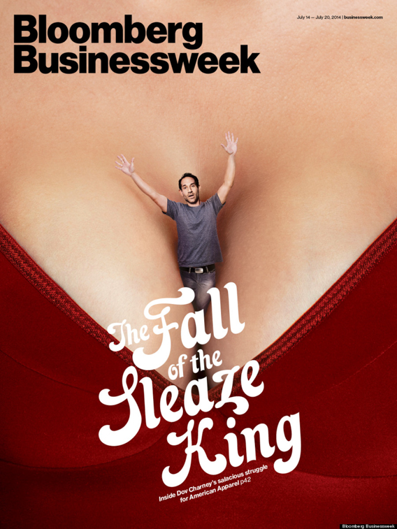
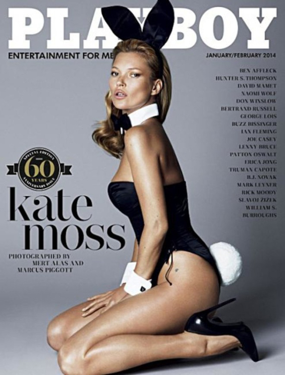
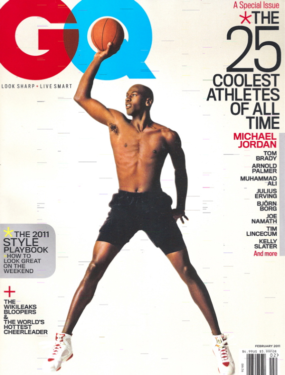
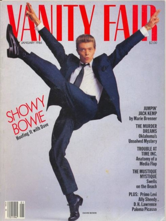
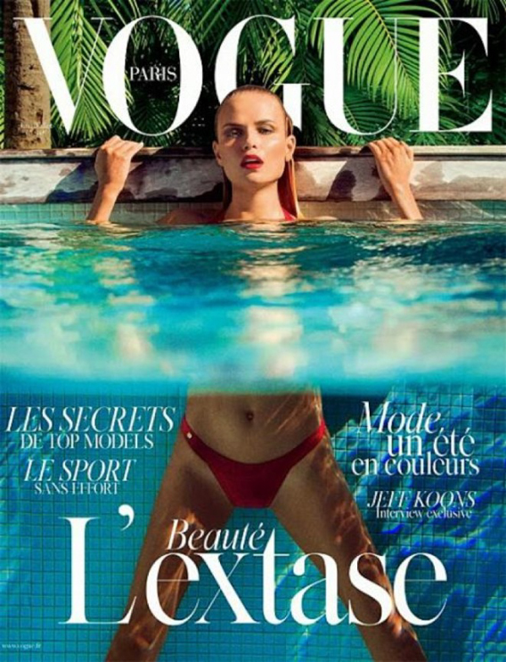
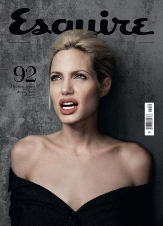
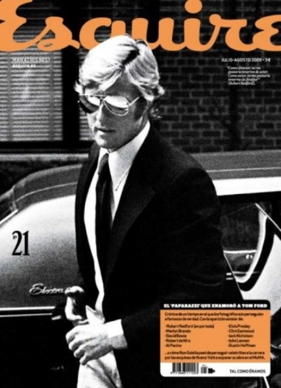
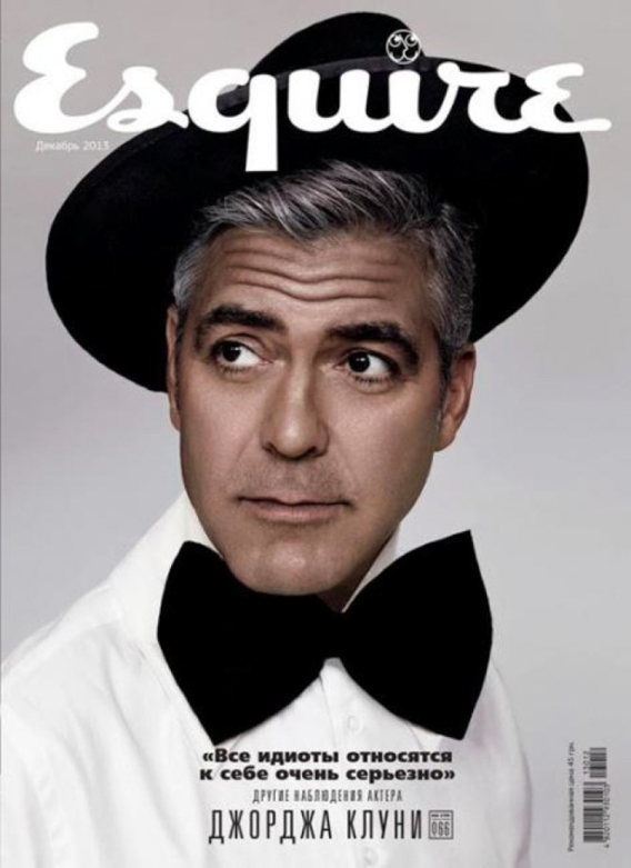
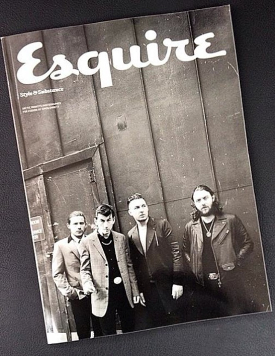
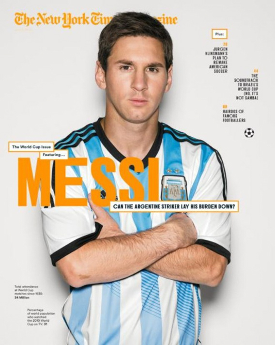
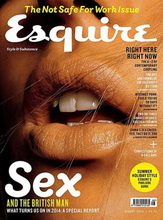
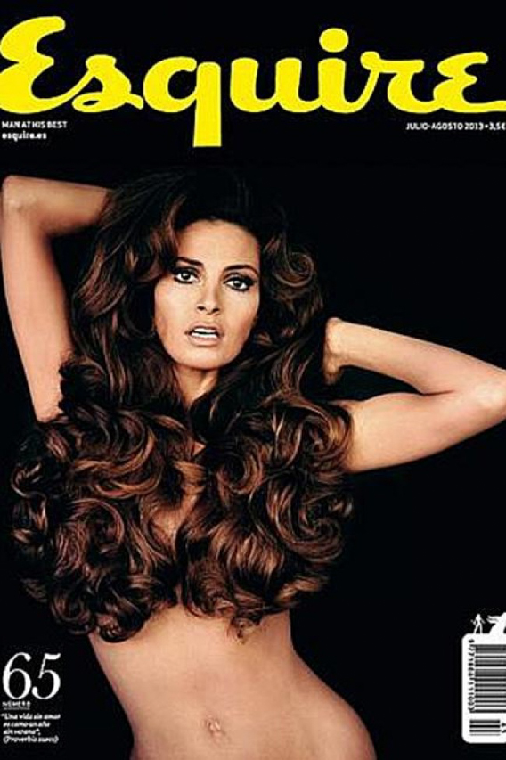
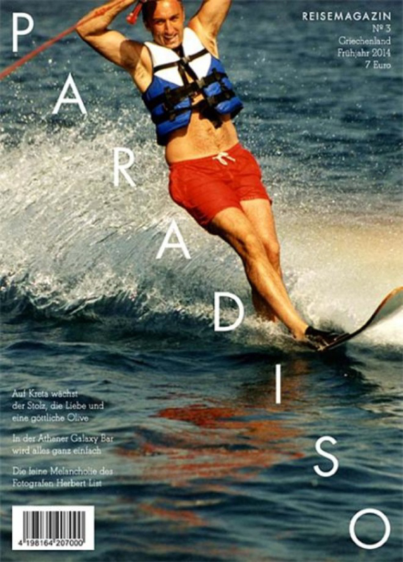
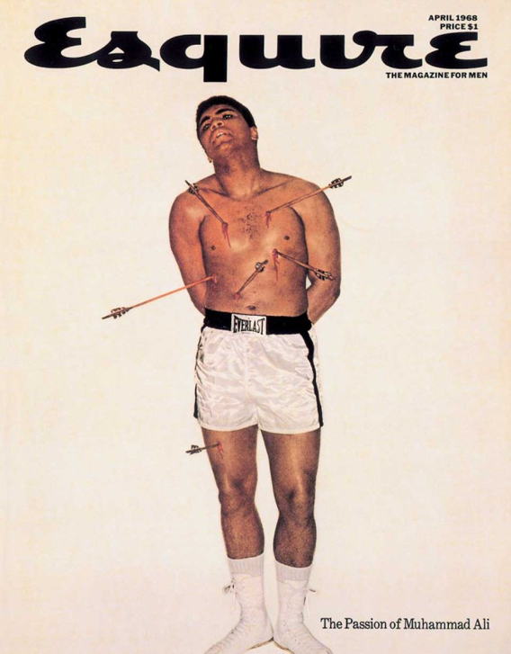
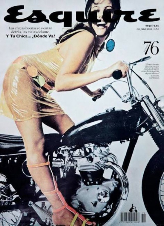
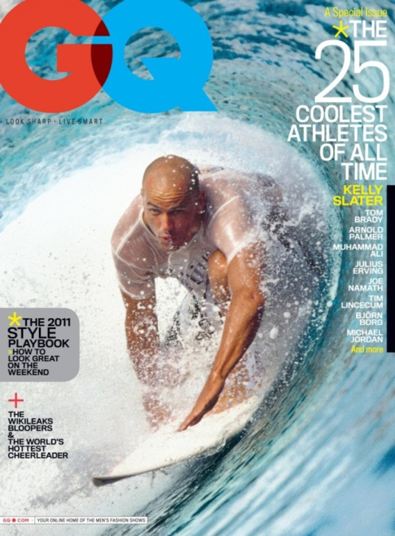
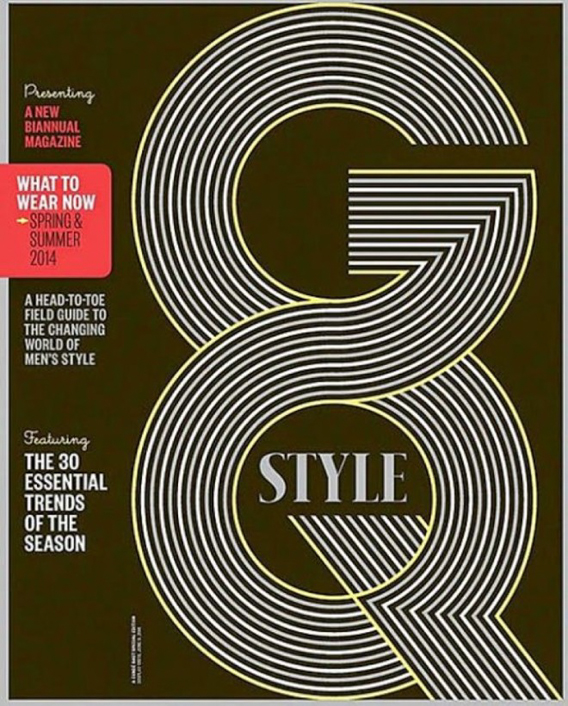
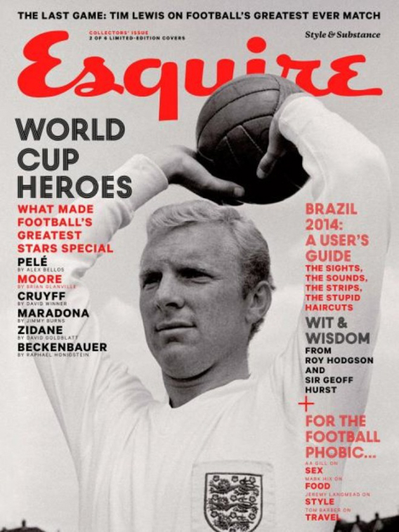
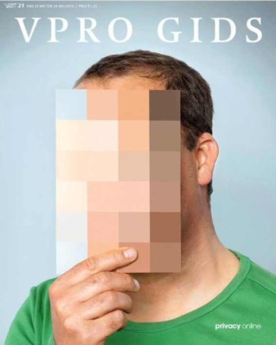
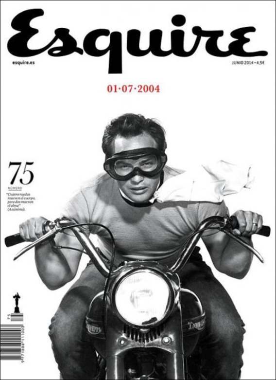
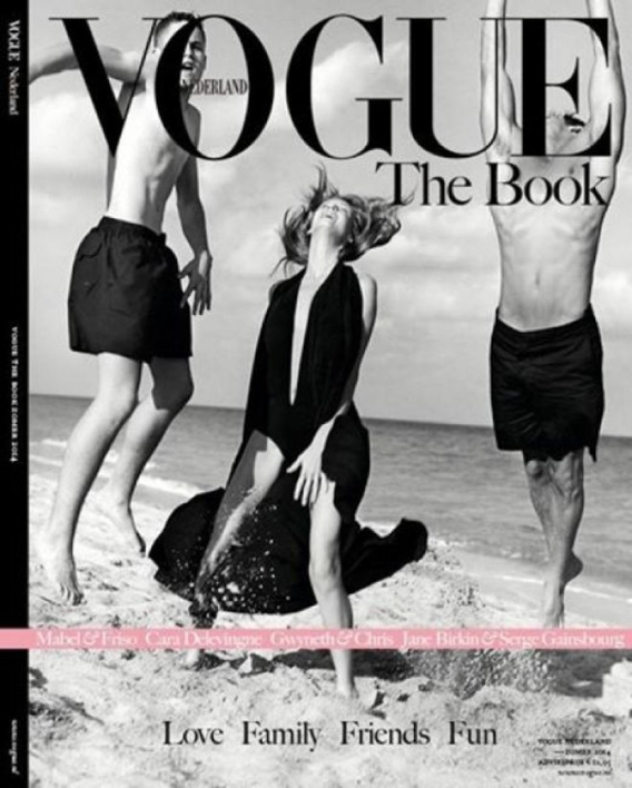
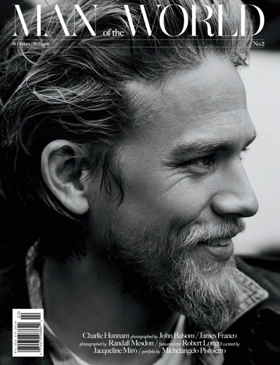
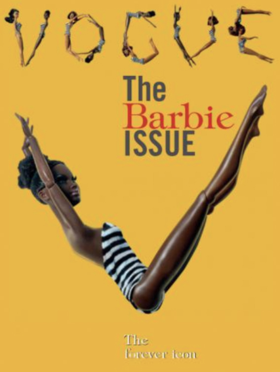
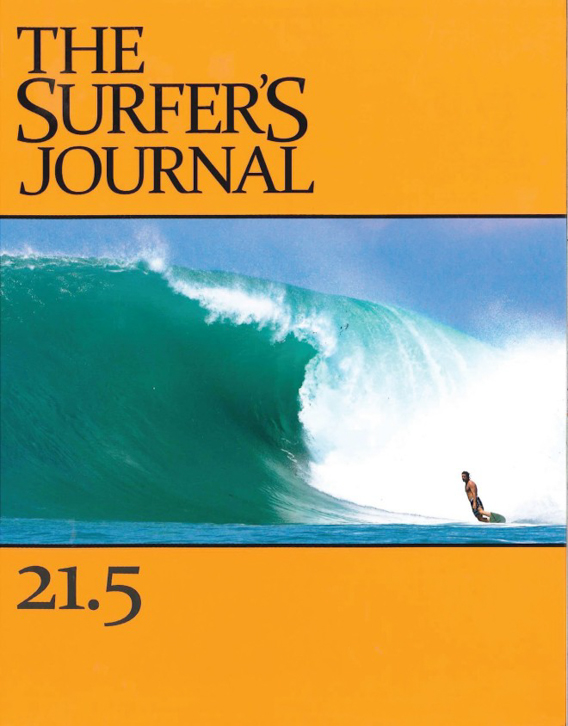
OK. You’ve made it this far so here’s a quiz to see if you’re made of the future greatness that editors are going to be falling love with. Evaluate the iconic covers below and come to a conclusion about them. Be honest with yourself!
*The answer for the quiz can be found in a “pull-down quote” after the cover images.
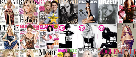
Here below you find different covers in time and style.







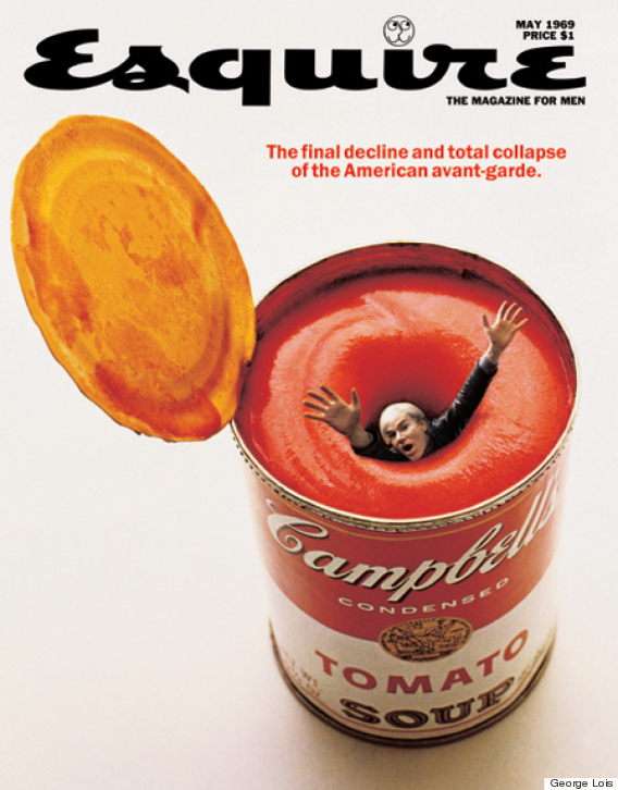
*Click: Quiz Answer

© 2014 Copyright ShootTheCenterfold.com. All rights reserved.




VERY GOOD AND EXELENT ARTICLE JARMO