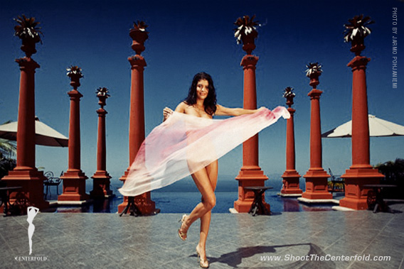
What Makes a Good Photo?
What does photography and Carnegie Hall have in common? There’s a lot of practice involved if you ever want to make it big. Yes, the joke’s a bit of a stretch, but there are certain fundamentals any photographer must master if they’re serious about their craft.
Thanks to technology, anybody with a camera can be a reasonably good photographer without any training or artistic ability… just set it on AUTO and you’re the next Ansel. While almost all photography courses teach the basics when it comes to settings and gear, very few of them cover the artistic side of it in any depth or examine the value of image structure.
As you’ve heard me say in the past, go into any other artistic field such as painting or sculpture and you’ll also get a crash course in training your eye on how to see your subject artistically. Not so much in photography. It’s too bad because it’s this lack of image structure that’s the reason why many photographers don’t make it past taking pics of their families, friends and pets (and even what they’re having for lunch, if Instagram and Facebook are any indication).
Once you’ve learned these few basic rules, you’ll be able to control of your photography, instead of your camera being in control of making things happen. The best thing about learning the basics is that all you need is a camera, a subject and you. That’s it. Sure, you can add on all the equipment and accessories you want, but it won’t make you a better photographer… even though it might make you a poorer one if you’re not careful.
The Basics
 Every image has a basic structure. Granted, they might not be in the right order and some might be lacking in a few key pieces of the puzzle, but if you really want to grab someone’s eye an image has to have a strong underlying compositional order.
What this means is that in order for an image to be composed correctly must have strong main elements, underlying colors and shapes, contrast, as well as a balance of positive and negative space.
Here’s a clue if you want to know if it’s being done right. Take a look at the main element. If it grabs your eye right off the bat, you’ve got a winner. If you can’t find the main element, or there doesn’t actually seem to be one, then you’ve found the problem. If there is a main element but you can’t figure out why it’s worth looking at – bam – you’ve got another problem.
Now, that’s not to say all images that don’t grab your attention are duds because even if don’t particularly like a picture, we can tell that the photographer at least followed the basics and it meant something to him (and maybe a few other people as well).
Every photo has details. Fundamentals are the main elements in the image, or obvious elements of light and dark, colors and shapes. Most photographers who don’t pay attention usually miss the details and don’t have a clue when it comes to the fundamentals of a great shot. No structure, no image.
Composition, subject and most importantly the mastery of lighting are the essential elements of photography. ~ Gary Cole
Even if the image was reduced to a blurry representation, the basic elements and colors should still be there. No amount of expensive high-grade gear or being a wizard at photoshopping can save a poorly constructed image.
The interesting thing about all this is that some photographers do end up with decent images occasionally if only by accident. We’re all bound to get lucky sometimes, but since these photographers usually have no idea how it happened, they can’t reproduce the effects either.
If you know your basics and are compositionally competent, you’ll be able to shoot anything. Photos without the basics, even though a great deal of time and effort went into them, are meaningless.
The reason there are so many bad photos is the lack of an underlying structure. While an image may be loaded with details, if these elements aren’t cohesive they’ll fall apart under scrutiny. People who are unaware of the basics are the great majority of people who keep throwing more money at more cameras, equipment and software, yet never getting better pictures.
Composition
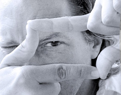 Here’s another secret: When composing, it’s okay to ignore the details. Exclude everything not directly contributing to the image. As you compose, only look at the broadest, basic lines and shapes in your image. Break it down to shapes and patterns so you can see how they fit.
Nothing in an image is as it seems… Or seems to be. Use every item in the image as a compositional element that supports the primary element. Think of it as a huge jigsaw puzzle you have to arrange to make the correct picture. Change camera position to cover all aspects of the image and rearrange the elements when you do so – or leave them alone and see if that works better. Sometimes the image is right in front of you, but you’re too busy taking the picture to see it.
Only when you get these basics right does anything else matter.
Symmetry and Balance are the most important elements of composition.
~ Jarmo Pohjaniemi
Eye Path
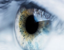 Our eyes are always drawn to the brightest or most colorful part of the image. After the main element has caught our attention, we begin to look to see what else is in the image. The important part is to make sure the viewer’s eye always returns to the primary subject.
Try to keep the details out of the corners (so eyes don’t wander off the image entirely) and be sure important elements aren’t cut by the frame edges. This is why HDR and other stitching processes are falling out of favor. There’s no reason to take multiple exposures when one properly exposed image will do the trick.
By leaving the frames dark or without detail, eyes will not wander off the edges and leaving the frame. An interesting aspect is that the way we view an image is tied to the way we read. When reading English, our eyes usually start at top left, travel horizontally to the right, then work our way to the bottom right.
Asian readers do the opposite by starting at the upper right corner and scanning an image from top to bottom traveling to the left side of the page. Anything that goes against the norm sends a signal to our brain that something isn’t right, much like driving a car on the wrong side of the road. It can be done, but it’s not advisable.
Our eyes look at light areas first, dark areas last. If an image can keep our attention in the lighter areas, then the eye will look in the darker areas to see if it’s missed anything. This is why low-contrast images are much more difficult to keep a viewer’s attention. With no light or dark areas to guide the eyes, it’s easy to lose interest quickly if not done properly.
To achieve a sellable image, the primary eye path should always be the subject… “WYSIWYG.” ~ Byron Newman
Burning and Dodging
 Technically known as selective lightening and darkening, dodging and burning is an important part of image editing if you were unable to catch these details in camera. Lighten the areas you want the eye to find, darken details you want to hide.
Edge burning can help bring attention to the subject, but it must be done subtly. The best way to ruin a shot is to make burning and dodging obvious. Start with small increments or percentages and work your way up to see what’s best.
The birth of dodging and burning as an art form emerged from the depth of the oldest darkrooms, and is still an essential process to achieve a perfect image.
~ Ales Bravnicar
Distractions
Photography and writing share much in common. Any element or detail that doesn’t help the image/story should be removed, no matter how good they may be. Stephen King is fond of saying “kill your darlings” because the worst thing a writer or photographer (or any creative mind) can do is to bore your audience and waste their time.
Be concise and precise. As in writing, have your image tell a story that’s worth “reading.” Add only details and subjects that can support your message. Think of a bad image like a run-on sentence. While it may be grammatically correct and structurally sound, people don’t like trying to figure out what you’re trying to say with your images and will quickly grow impatient and look elsewhere. Viewers and readers are very much the same. They can’t hang around waiting for you to get to the point.

Here is a sample that may work, depending on the purpose and message of the image. By having a second person/model in the background, as circled in yellow, it may be too much of a distraction. If this was meant as a swimsuit product photo, then the second model would be a problem. If this was a shoot to portray good times at the pool, it could work and speak more broadly about the scene what’s happening there.
Color
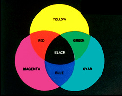 Books have been written about color. Look online and for any art website and look. Just look. Warm colors – red, orange and yellow – appear to move forward towards the viewer. Our eyes are attracted to them first. Cool colors – greens, blues and violets, recede.
Colors need to be in harmony. In art, there are a million ways to do this, but photographers have it easy; what looks good is good. Get rid of the things that don’t look good. Art is very subjective, obviously. Not everyone will like your color combinations, but the important thing is that they appeal to you. Trying to make someone else happy is never a good situation (unless you’re being paid to do so, but that’s a different story).
Color is the vividness and principle of life. ~ Steve Wayda
If you’re shooting in color, then you must know what you’re doing. While photography may seem like magic, getting your colors to come out right is anything but. As with other elements in your image, color should be an element in its own right. And in the same manner as described previously, if a color doesn’t add to the image, remove it. If colors simply aren’t working for you, the only way to save an image is to shoot it in black and white.
Lighting is Everything
 Without a doubt, lighting is THE most important thing about photography and much too lengthy of a topic to discuss thoroughly here in this limited space. What can be said is that professional photographers learn to respect and pay close attention to all lighting situations, while hobbyists and amateurs tend to ignore it or are blissfully unaware of the consequences.
To make a long story short, light is what defines our work. The lack of light is also a huge factor in what we choose to show and which parts to hide. To become truly adept at our craft, we must master not only light, but also the shadows.
“Let there be light” in Genesis 1:3, we understand light is as essential to photography as it is to life. ~ Gary Cole
Close One Eye
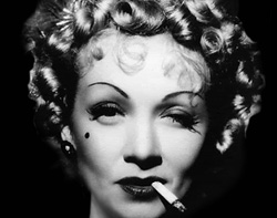 It’s a simple fact: Life comes in three dimensions, not to mention sounds, smells and everything else experienced by human existence. It’s extremely difficult to capture life in a flat, two-dimensional medium, but it can be done.
One of the many reasons we enjoy photography is that we love to capture the three dimensions. Unfortunately, it’s also the main reason many of photos fall short. When Ansel Adams was a young man, about 14, his father purchased a small box camera as a birthday gift. Adams, a lover of the outdoors, persuaded his father to make the trip from their San Francisco home to Yosemite National Park. The rapture created by the grandeur of the mighty mountains was only matched by his despair when the tiny camera failed to capture what he felt during that first experience. However, it did cause Adams to become one, if not the most noted landscape photographer in the existence of photography.
Here’s a trick if you want to see the same way your camera does: close one eye. The images you see will be flattened into a two-dimensional perspective and the effect that caused you to be excited about the possibility of capturing a masterpiece will turn into a mere snapshot.
Sorry to rain on your parade, but this is what happens when our expectations are a bit too high and our photographic expertise is a bit too low. With a bit of practice, learning to see with one eye will force you into really seeing what is there and turn your photos into something worthwhile. The good part is that it’ll also let you know which scenes to pass by or give a closer look before committing them to digital.
Sometimes to be able to see, all you need is one eye! ~ Ric Moore
Never Imitate
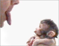 Speaking of Ansel, no one can be as good as he is, or as good as Stieglitz, Avedon, or even as amazing as our own Steve Wayda. Don’t even try.
The simple reason that you can’t be as good as they are is because… you’re not them, you’re you. Only you can be you. Look at it this way, none of them can ever be as good at being you as you are.
The biggest difference between you and them is that they got over worrying about technique and put all their efforts into making good images and doing what they love. The fastest way to taking boring images is trying to be something you’re not, or make it into a contest and try to prove you’re better than everyone else. Even worse, trying to please everyone except yourself. Do what you like and be the best you can be because that’s where the next masterpiece will come.
And one other thing; don’t ever do it for the money. If you do it for the money, two things will happen. You’ll get paid, but if you’re heart wasn’t in it, it won’t mean anything and once the money’s been spent, you’ll be back to where you started with little to show for your work, even your bills are paid. If you do it for the love of the craft, you may or may not get paid, and you might get your cable turned off, but there’s no comparison to the feeling of having accomplished something worthwhile. No one can take that away from you, even if you’re dead broke.
Imitation is the sincerest form of flattery.” – Charles Caleb Colton
You Can’t Go Back
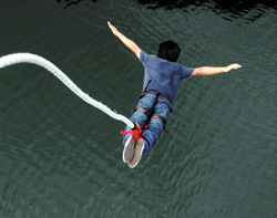 When the conditions are right, shoot. No matter if you’re working in the studio or on location, the situation can change with lightning speed and that moment will be gone forever. This is especially true when working in glamour photography and the model hits precisely the right pose – the attitude you’ve been looking for is suddenly there and you only have one chance to catch it.
This goes for outdoors as well. The light may never be the same. The environment may change, entire buildings might disappear, or you’ll never be able to work with the model again. But even if you miss your chance, keep shooting – your next chance may be just around the corner and waiting for you to click the shutter.
Summary
Learn basic compositional structure and you’ll be making better images almost immediately. Many photographers just point and shoot, hoping that the luck of the draw will be on their side, but it usually never is – planning and following procedure is the only way to get great shots every time.
A camera will capture anything and everything it’s pointed at, regardless if you want it in the image or not. A camera doesn’t lie, but it’ll believe whatever you tell it. Make sure it only sees what you want to see. A camera doesn’t know anything about composition either. That’s why it doesn’t matter how much you spend on a camera or fancy lenses – it’s only as good as the person working the controls. Once you snap the shutter, that’s it and not all the Photoshop magic in the world can make up for poor photo skills.
I always like to end on an “up” note, so I’ll say that as a photographer, you have a miraculous, amazing piece of equipment in your hands and at your disposal, but there’s an even better one sitting between your ears. Learn to use it. Learn to see everyday ordinary things in new ways and you’ll always astound yourself.
Most of all, never give up. There will be times when you feel like giving up and the junk that’s coming out of your camera is only good for filling up your laptop’s recycle bin or waste basket. As with all creative endeavors, you never know when you’re creating a masterpiece, but with knowledge, skill, patience and determination, you will succeed.

© 2013 Copyright ShootTheCenterfold.com. All rights reserved


